Project
Approached by ClientTrack with a request of helping them create a method of unifying their system on a visual front. As the years of development had passed their system modules reflect the year it was created, this lead to a disenfranchised feeling during use. After discussions it was advised to start with a pattern library that could be joined with their current style guide for a more robust system design.
Role
- Consultation
- UI Design
- Documentation
Inventory
To get started on this project I took and inventory of all the global elements, components, and lastly modules [Require JS] that would be essential to starting ClientTracks pattern library. Since the application was already developed grid layouts and data visualization have already been put into place and may be revisited at a later time.
Global | Foundation
- Grid System
- Data Visualization
- Color
- Typography
- Iconography
Components
- Navigation
- Buttons
- Form Elements
- Lists
- Tables
- Helper Classes
Modules
- Dialog
- Feedback
- Carousel
- Tabs
Pattern Set Up
After we had an inventory we decided how we would set up our documentation and who was responsible for each deliverable. Since this was just going to be a baseline pattern library that is expandable some guidelines need to be set, getting designer, developer and writer on the same page.
Pattern
 UI Patterns are designed, with all field attributes, before and afters, requirements, validation and so
forth. I will be designing and delivering baseline UI elements.
UI Patterns are designed, with all field attributes, before and afters, requirements, validation and so
forth. I will be designing and delivering baseline UI elements.
Code
 Markup Snippets in a copy/paste format. Keeps code clean and efficient. Deliverable at this stage happens
with collaboration between designer and developer.
Markup Snippets in a copy/paste format. Keeps code clean and efficient. Deliverable at this stage happens
with collaboration between designer and developer.
Notes
 All the extras to make it all come together, special classes, disabling, and validation in some cases.
Throwing a technical copy writer into the mix to keep these notes on point.
All the extras to make it all come together, special classes, disabling, and validation in some cases.
Throwing a technical copy writer into the mix to keep these notes on point.
Pattern Examples
Not including everything that was design and put together here is some examples of how items played out. Buttons, Form Elements, and things like tables all wrapped in nice packaging with explanation that let just about anyone use their new elements.
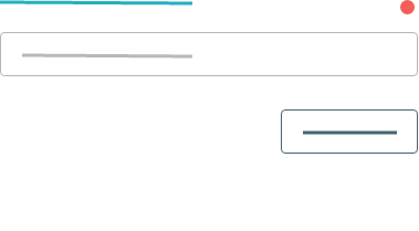
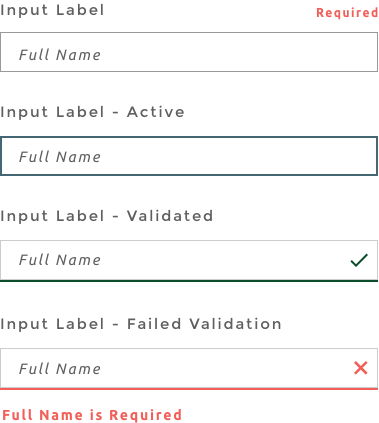
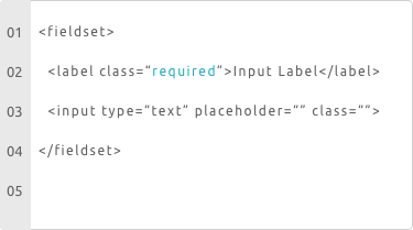
Text Input
Code
Notes
Use the class required on label elements to add the red required tag.
Toggle class active on input tag to activate the :hover and :focus styles.
Form Validation happens automatically in the system expect these results on form submit.
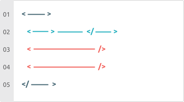
Iconography
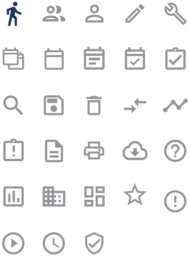
Code
Notes
Use the class ct-icons to call the icon library into activation then use either a character code in :before and :after elements or the assigned class.
Buttons
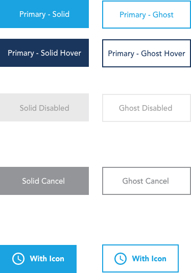
Code
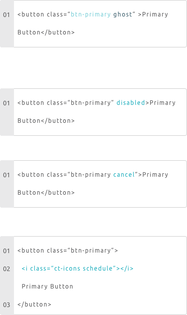
Notes
When using buttons the class btn-primary is always needed, use a second class of ghost to get outlined button.
Toggle the disabled attribute to turn buttons off until certain metrics have been met.
Add-on class of cancel can be used for buttons that are available but cautionary. e.g. Reset
Use a i tag to add icons to any button, call the ct-icons to activate icon library and then your icon class.
Going Together
Not including everything that was design and put together here is some examples of how items played out. Buttons, Form Elements, and things like tables all wrapped in nice packaging with explanation that let just about anyone use their new elements.
Navigation
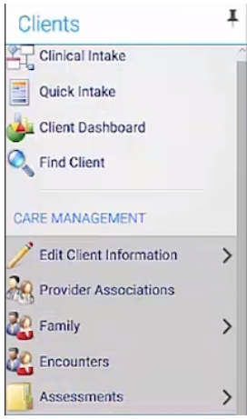 Apologizes for the image quality it was the only one that was available to me.
Pattern Library Navigation
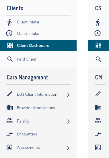
Change Notes
Original navigation elements had some stand out issues:
- Navigation headers are mismatched.
- Whitespace is non-existent.
- Icon families don’t match throughout design.
- No page indication | hover or focus state.
- Not adaptive or responsive.
- Failed contrast - to be fair the original design I did also failed contrast test.
The Pattern library addresses all the issues above and has the flexibility and expandability to change with growth.
Button Group

Pattern Library Button Group

Change Notes
Buttons Groups weren’t really troublesome, we did have some feedback that the button order was an issue with users. Order was something that could be easy changed so while example here shows different it very well could have stayed the way it was with the more modern styles.