Project
Desktop and Mobile tracking system used for recruitment, assessment, hire, and training. We were task with taking a one-drive file drop system to a more robust online solution within a secure intranet environment.
Role
- UX Design
- Information Architecture
- User Journeys
- Prototyping
- Visual Design
The Challenge
We were challenged with an extremely complex system of files that needed to be made into a workable platform for both user and administrators. Both online and offline technology issues came into play. Gest wanted a more robust and manageable setup to record and assess their candidates, as well as, recertify current employees.
This new system would need to unify communication and collaboration across multiple offices, while still giving the administrators the bird eyes view of the entire process.
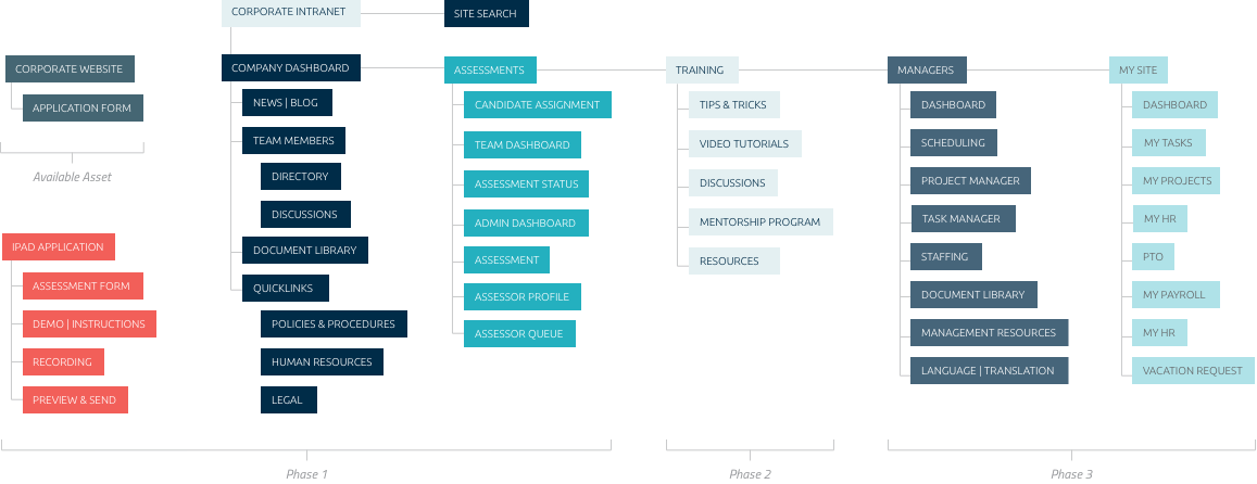
Information Architecture
Before we started on anything we took an inventory of their current intranet, it was not in the greatest of states and organization of available content needed to be addressed. We conducted stakeholder interviews to gather important topics in their current inventory and ran several closed card sorting exercises with diverse group of internal and external users. Based on the information received we started lay the ground work for the project.
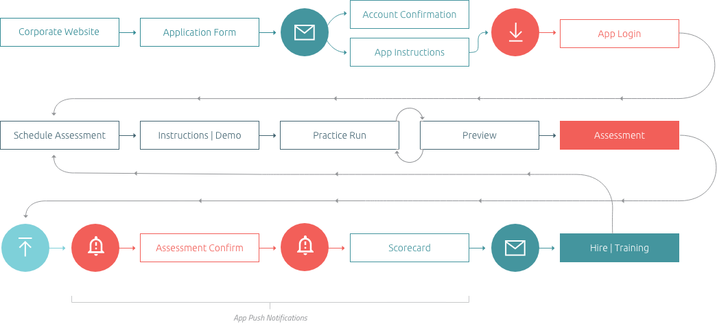
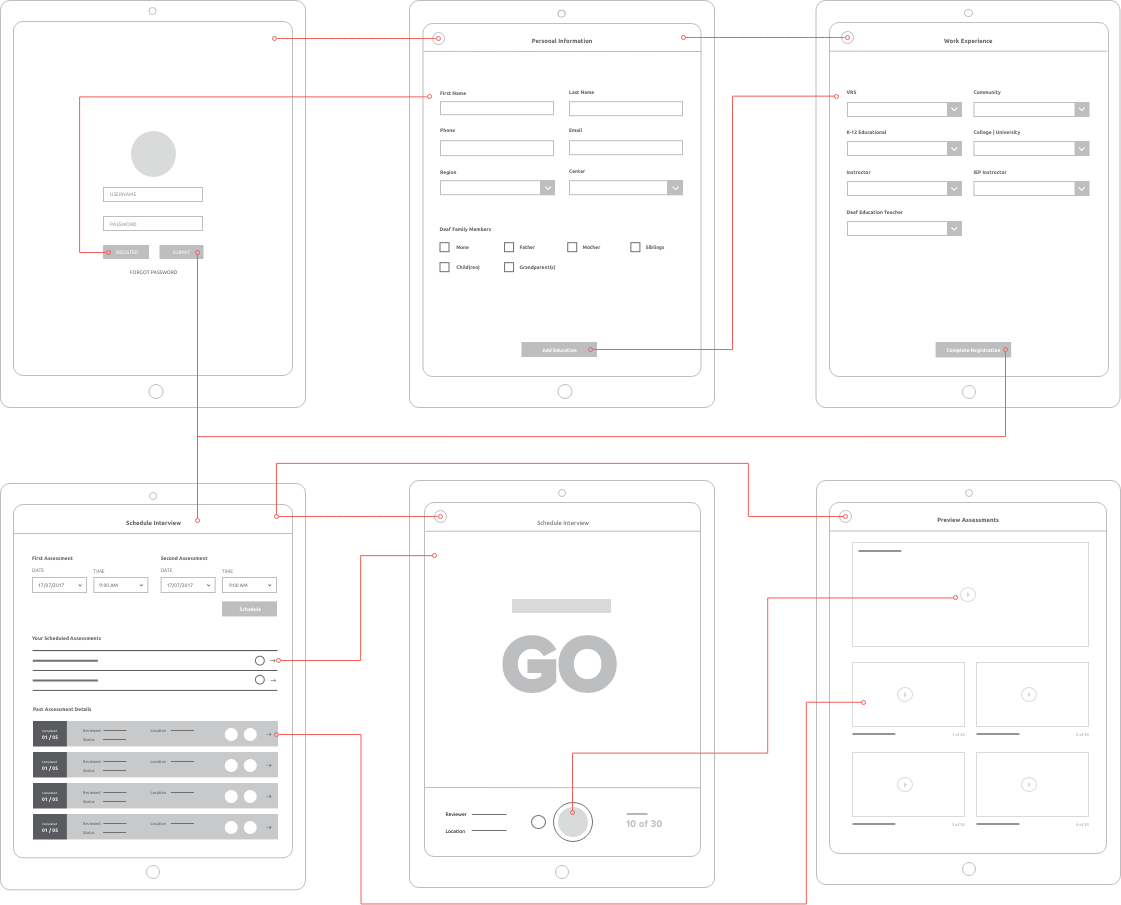
User Journey
Using the current excel process, information architecture and employee interviews we mapped out a general flow for the hiring process for two sets of users. First being the candidate who is completely new to the system and requires registration. The second being employees and administrators who are familiar with the system and don’t require registration.
Wireframes
At this stage we have a pretty decent amount of user feedback and information organized in a digestible way we set out on putting some elements into place. Creating wireframes to get the base elements on the page in a quick and efficient fashion.
Wireframes where used with focus groups that we performed weekly to present ideas and gather feedback on functionality or lack thereof. This is one example of a set of about 50 different views.
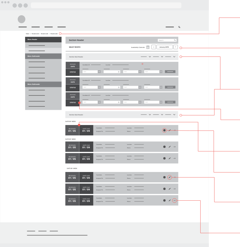
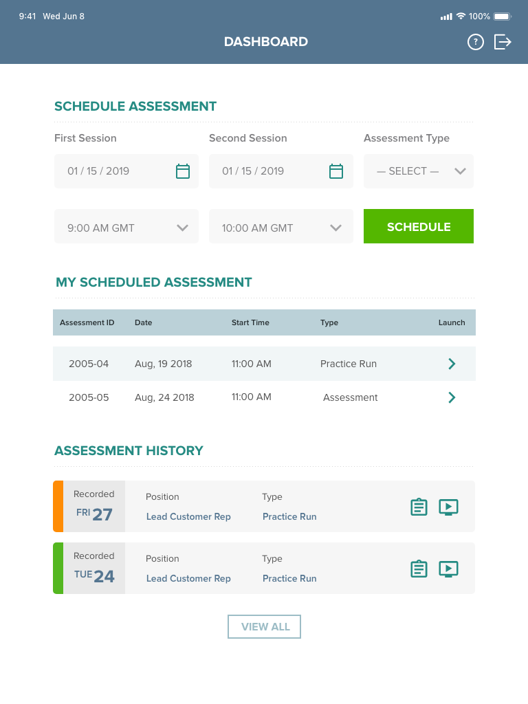
- Application has numerous dashboards and locations. Classic breadcrumb menu for navigation assistance.
- Administrator and Employees can have task booked months in advance. Meetings are also included in list for admins.
- Location | Region | Status filter for anyone working multiple locations.
- Status Selector for accepting or rejecting tasks.
- Calendar Indicators large for quick overview.
- Priority Indication - Color System for visual indication.
- Edit Task - Modal Option for Reassign, Reschedule, or Flag for Administrator.
- Launch Task.
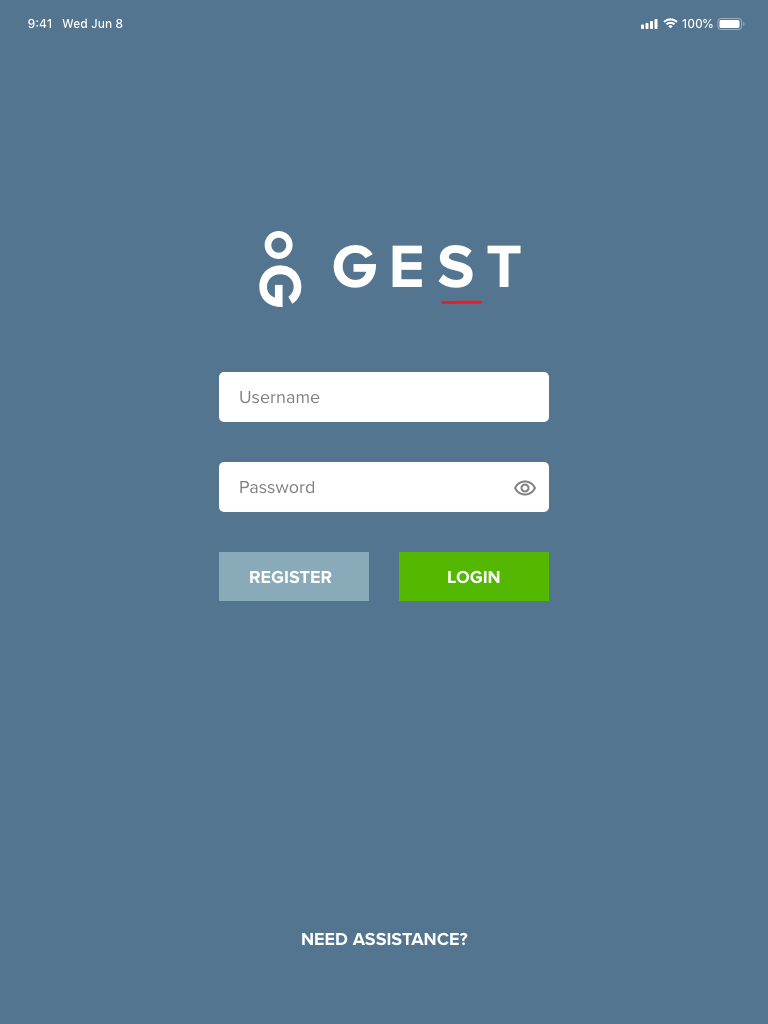
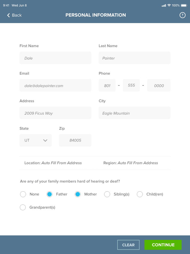
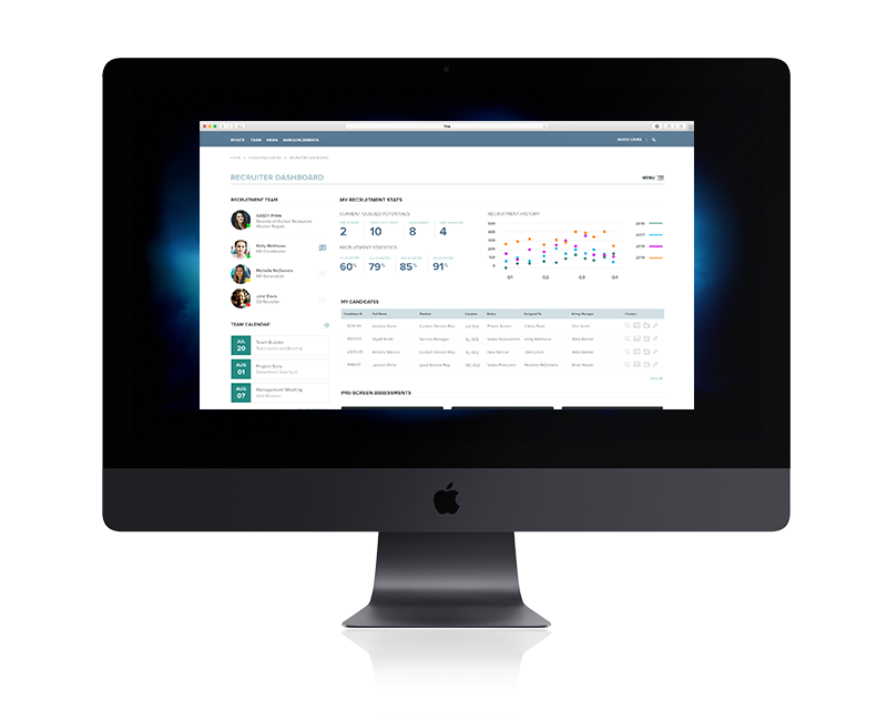
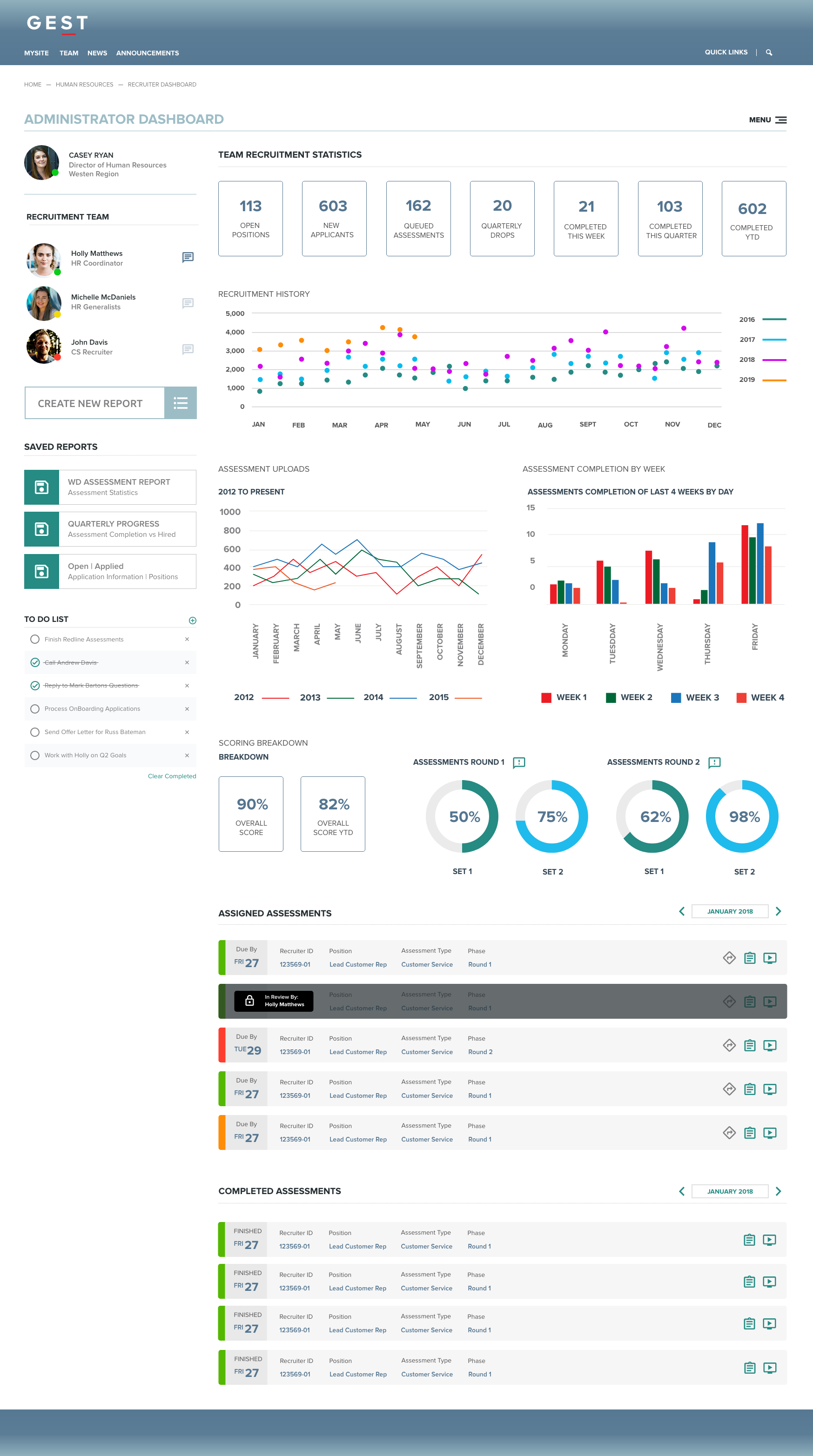
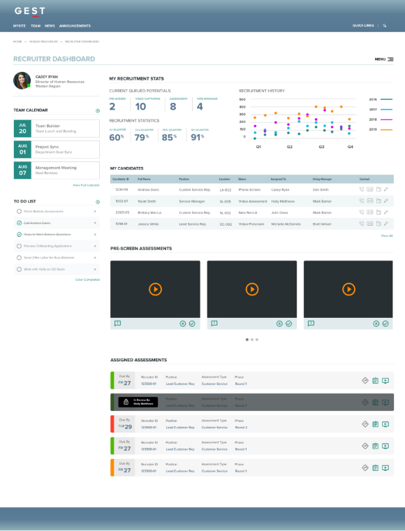
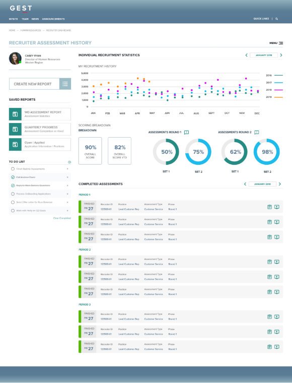
User Interface
After we had hammered out the functionality in a low fidelity wireframes using clickable prototypes we felt we had reached a point it was time to put a face to the product. Development was chomping at the bit so first and second rounds went fast. I failed keeping track of those changes so what you see here is phase 1 design that ended up being launched.
iOS Application